A preemptive apology - this post will not be Earth-shattering. It won't be terribly exciting. And it might not even seem like it is relevant to anything you are doing in the classroom.
The beauty in fringe educational technology is the subtlety with which it exists in everything you do as an educator. I've said it before - technology isn't really technology until it is used, and that sentiment translates to all realms of technology. A Smartboard is just a tool. A teacher who doesn't know how to use it properly only hinders the flow of the class, whereas a talented educator is an artist with the Smartboard, painting a beautiful lesson with only the tools that add to the fluidity of the lesson.
The sentiment that the technology is a persistent lens through which the educator looks - a unifying theme that quietly runs through every minutiae of the class - is the most important realization in the implementation of technology in the classroom. It is the responsible use of handcrafted, tailored technology that yields a handcrafted, custom, almost artisan experience for the learners.
It is with this thought that I introduce a philosophy I call mobile mentality. It's important. It's really important. And unfortunately, it is very underrated.
Mobile mentality is a guiding principle for how you, as an educator, craft your materials (both online resources as well as documents to distribute in class). More and more students are consuming information on mobile platforms (phones and tablets), although there hasn't really been an effort for educators to bear this in mind as the resources are created.
There are a few simple guidelines I recommend for designing materials, whether it is for online consumption or as a hard copy to be distributed (the latter is very important, as resources you design now may be put online later, or even translated to eBooks as they become more popular - it's better to future-proof them now as opposed to retrofitting them later).
Simple things to keep in mind:
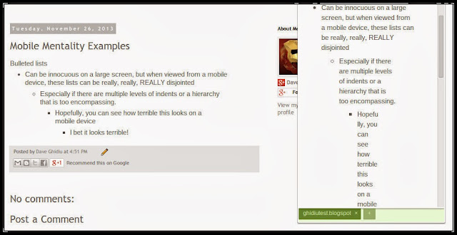
- Bulleted and numbered lists are okay, but try not to use more than one or two levels of indenting. Sure, on a widescreen computer there are no issues. But when a massively indented list is rendered on a device with a screen that is only 2.5 inches across, it breaks up the text into a disjointed word puzzle. The screenshot below juxtaposes a desktop view with a mobile view.
 |
| Apparently E.E. Cummings designs mobile sites. |
- Tables (and other objects) are better off being based as a percentage (instead of pixels). A table that is 500 pixels wide would spill off the screen of a device that can only display 400 pixels, whereas a table that is 100% wide will always resize to the screen of the device. This is especially important to know when using Blackboard or ANGEL, as the table size defaults to 200px (200 pixels). Replace "200px" with "200%", and you're in business.
+-+Cropped.jpg) |
| Size matters. |
- Don't get crazy with layout. Generally speaking, it is better to be simple. Unless you have experience with graphic design, don't pretend that you have experience with graphic design. When your materials inevitably get converted to eBook form or are put online, the simpler they are, the better. Don't try to group text with pictures. Write some text, center a picture underneath it, and then write more text. It sounds tired and uninspired, but it's guaranteed to look really clean and professional.
 |
| iFormat is iBetter with iSimplicity. |
- Using tables is a tricky proposition. Tables work better if they only have one or two columns. If the data can be structured accordingly, then go for a table (remember to base it on percentage). Otherwise, consider alternatives. In the following example, the text was broken up by horizontal lines and centered titles as opposed to a table. When rendering on a mobile device, avoiding tables provides a much better experience.
 |
| Tables are for suckers. |
 |
| Finally! A good use for a horizontal rule! |
- You should probably use the alt and title tag when inserting images. The difference between the two tags is small, and unless you are a nerdy web developer, you don't need to know the difference (although you can check out this nice discussion if you want). I usually use the same text in my alt tag as I do in my title tag of any image, but to be in 508 compliance, you must use the alt tag.
- Microsoft Word (and most online developing tools) have an often ignored function known as Styles. You've probably seen it, but thought to yourself that it is just easier to highlight, bold, and center a title instead of going all the way to the Style menu. Next time, though, use Styles. They aren't hard to customize, and will save you time in the long run. There are a lot of reasons to use them, but the most important is that if Styles are implemented in Word, then it translates much better when online, as well as when converted to an eBook.
- Know that PDF's are probably the best way to distribute information because anyone can read it, and you know the integrity of the layout is preserved. However, PDF files are probably one of the worst for distributing to mobile devices. Different PDF readers will display the document differently, and there is usually a need to zoom in and "pan and scan" the PDF if reading it on a mobile device. The picture below indicates the inability for mobile screens to display a PDF easily.
 |
| Remember when reading a PDF used to be so simple? |
- Put borders around graphics. A thin, "hairline" border is sufficient. But if the image doesn't have a transparent background, it will look like a seventh grade science fair project when it is used on backgrounds different than what it was intended for. Consider this picture of some Legos, which has a white background so it looks nice and neat on this particular page:
- The problem is that when this image is rendered onto a page with a colored background, it becomes clear that the image has a white background and doesn't look quite right. Ameliorate this by putting a black border around the image (either in the HTML editor, or better yet, use photo editing software to put an actual border around the image).
 |
| Legos never looked so unappealing. |
By the way, to view any website on your desktop as if it were being viewed on a mobile device, install the Glimpse extension for Google Chrome. It's a reliable indicator of how a site you are on would render on a mobile device.
Save yourself some trouble and embody some mobile mentality.


As a web developer, I have found this Chrome extension to be pretty valuable:
ReplyDeletehttps://chrome.google.com/webstore/detail/ripple-emulator-beta/geelfhphabnejjhdalkjhgipohgpdnoc
This allows emulation of various mobile devices/operating systems while indicating horizontal or vertical layout.
I hadn't seen this extension, but I just installed it and it works great! I love the ability to specify the exact mobile device to be tested.
DeleteVery slick.